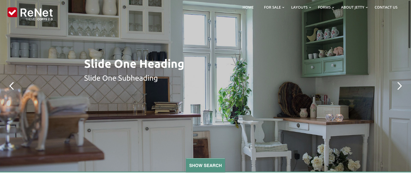
Home Page Design
Each element of the home page can be designed to suit your needs and style. They can even be removed if you would prefer a cleaner look.

Image Slider
The image slider at the top of the page is the first introduction to your brand. There are a number of different options for this slider. You can have as many lifestyle images as you like, chosen and uploaded via the ReNet software. Or you can choose to highlight current listings using a selection process within the ReNet software. These images can be full screen or centered in the middle and can be narrow in height or tall. The transition between images can be fluid or geometric or you can even choose to keep it to one still image.

Welcome box
The first content box is the perfect spot for a quick "highlight" of what your business has to offer. It is intended to be only a few sentences and encourage readers to explore the site further. This area can also include content of photos and video.

Of Interest
The Of Interest boxes are three "quick links" that serve to highlight the areas of your business that you want to most call attention to. When clicked, these boxes will direct to whichever page you specify and are effective Call to Action tools. You have the ability to customise these to the three quick links that you would like.
